Pastel texture packs are common; good pastel texture packs are not. The usual problem is contrast — wash everything out and suddenly you can't tell stone from andesite. Pastel Biomes mostly avoids that trap.
Palette
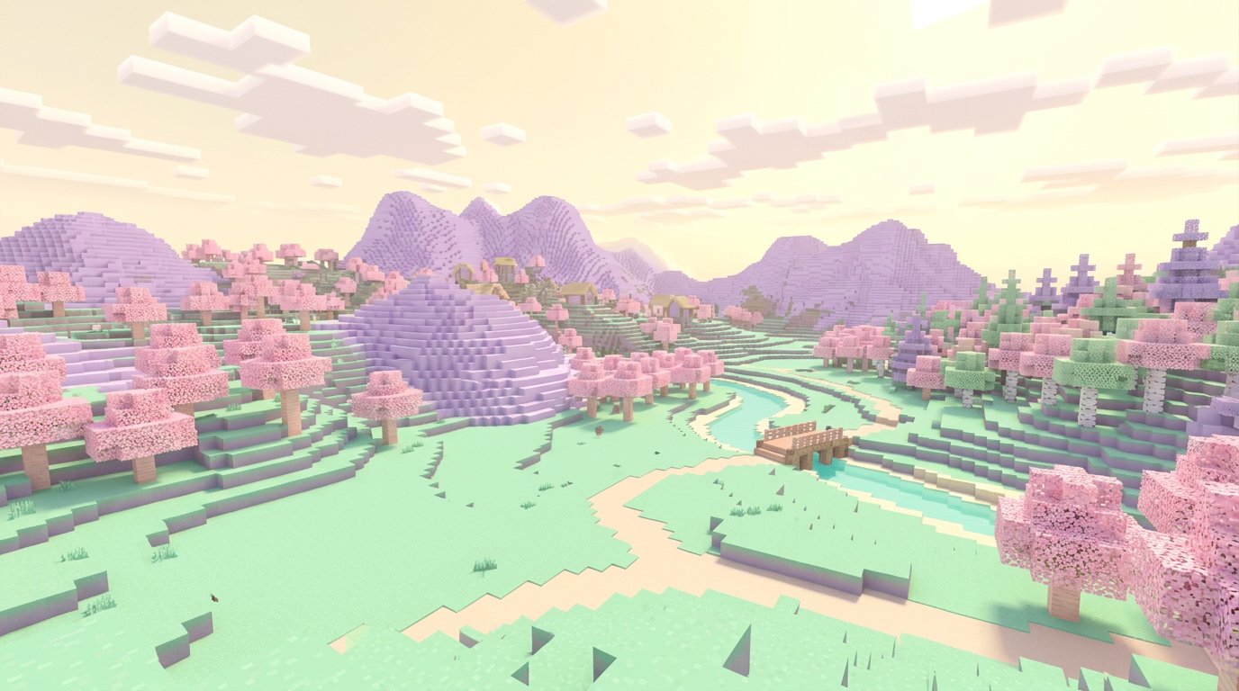
Grass becomes mint, oak leaves turn a soft peach, and cherry groves glow almost white. Crucially, each biome keeps its own identity: deserts are buttery yellow, taigas a dusty blue-green. Flying over a world with this pack feels like looking at a watercolour map.
In Survival
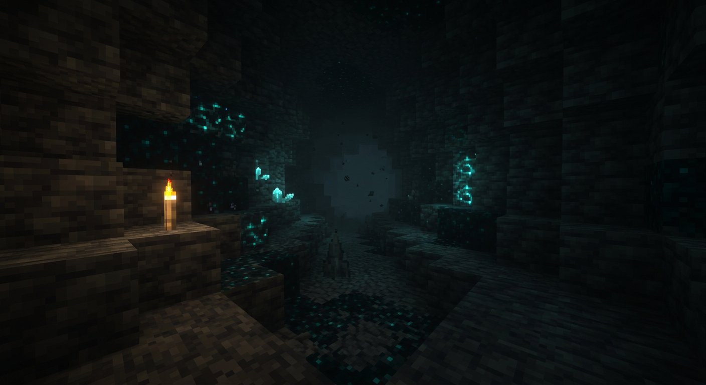
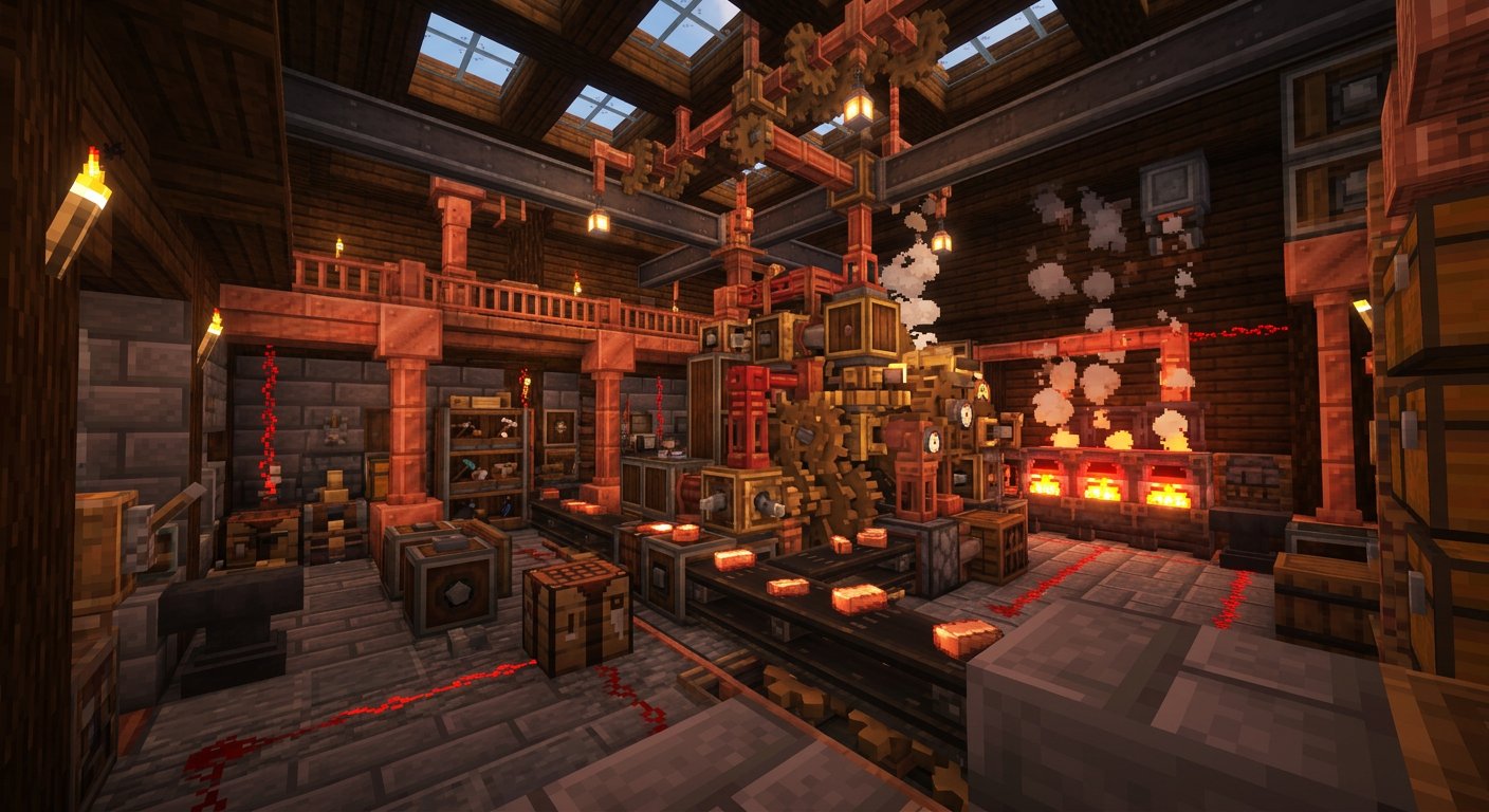
We played a week of survival with it, and it held up better than expected. Mobs remain easy to read, and the lighter palette actually makes caves feel less oppressive. The exceptions are ores — iron and copper blend into their stone backgrounds — and redstone dust, which is a pale pink that's hard to see on light blocks.
Who It's For
Builders and screenshot-takers, first and foremost. If you spend most of your time mining, you may find yourself squinting.
The Verdict
Pastel Biomes is a lovely, cohesive repaint that holds up in everyday survival. Some ores and redstone components lose contrast, but builders will adore it.
Pros
- Cohesive palette across every biome
- Stays at 16x, so it runs everywhere
- Beautiful for builds and screenshots
Cons
- Some ores are hard to spot underground
- Redstone components lack contrast
Played something worth sharing?
Help fellow explorers discover more of the Marketplace. Tell us what you loved, what fell short, and who should play next — your next review could be their next great find.